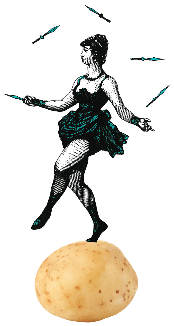
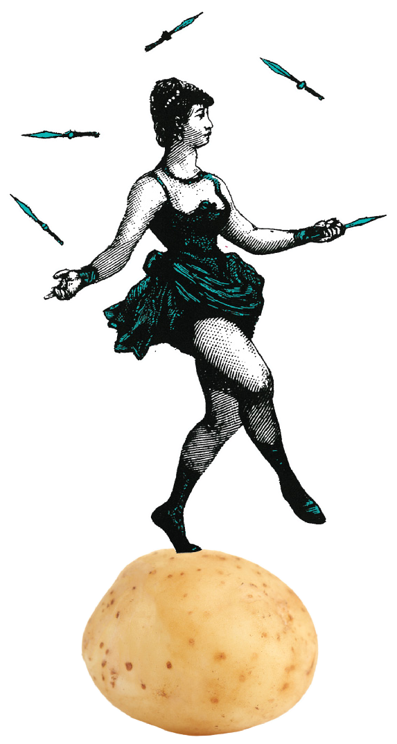
Leisurely
Luscious
Literary
Lens
THE CIRCUS MAGAZINE
The Circus Magazine is an annual magazine with monographic issues, hosting articles in different languages. Each issue deepens a specific topic related to the Circus Arts and comprehends a main article and a book review - both in English - as well as a guest article in a different language.
In the last three issues, you can find topics such as:
- Circus and Cultural Studies - guest article in Spanish
- Circus and the Arts - guest article in Italian
- Social Circus - guest article in French
A noticeable feature of The Circus Magazine is the possibility to explore entities across the articles within an issue. In addition, given the multilingual essence of the issues, the entities were homogeneously indexed in English, as to provide a unique access to persons, places, keywords and organizations despite the different languages. For those entities for which a Wikidata entry exists, a direct link was also provided as an additional tool within the metadata viewer.
The Circus Magazine also allows the reader to choose whether to visualize the articles with the default styling or by selecting and changing on-the-fly the aesthetic of the issue, to one's preference among six provided styles, detailed in the Documentation section.
All the articles published on The Circus Magazine have been selected for their quality and interesting content and taken from already published versions in academic journals or web publications released with a maximum closure of CC-BY-SA-NC licence. This kind of licence allowed us to reuse the articles in the project by rewarding the original version.
How to read The Circus Magazine
From this Home Page, you can access both the Documentation, the Disclaimer and the proper Issue Viewer. This latter is organized as to allow the contemporary, parallel visualization of the three articles published within an issue.
The main article is displayed within the major box, on the left-center of the page, while the other two in aside boxes on its right. Nevertheless, it is possible to take advantage of the "change main article" button in order to switch the visualized position of the articles.
The Issue's metadata, together with the related entities, are displayed on the left side of the viewer. You can further analyse the entities by clicking on them: this will highlight their occurrences within the articles, that can be gone through them via the popup navigation tool.
The Circus Magazine styles is especially thought and optimized for a Desktop visualization within the Chrome browser.
Sneak Peek
In the next issue we will present further functionalities, such as a timeline showing time distribution, a stunning geo-visualization of the places involved, as well as a more detailed hierarchical organization of the places within continents, countries, cities etc.
DISCLAIMER
The purpose of this website is to explore various types of typographic and layout styles for text documents. It was developed as an end-of-course project for the Information Modeling and Web Technologies course of the Master's Degree in Digital Humanities and Digital Knowledge - a.y. 2020-2021 - of the University of Bologna, under prof. Fabio Vitali.
The documents contained in this web site have been selected for their length and complexity from the sources stated in the list below. Their publication here is not intended to be an alternative or replace their original locations:
- Bolognesi, Mario Fernando. From the Fair Theatre to the Modern Circus. Revista Brasileira de Estudos da Presença 10 (2020). https://doi.org/10.1590/2237-266093237
- Miternique, Hugo Capellà. El lloc de la diferència a Xile: circ i transformisme. El cas del Circo Timoteo. Documents d anàlisi geogràfica 58.3 (2012): 351-372. https://raco.cat/index.php/DocumentsAnalisi/article/view/259380
- Tsakona, Villy. Book review: Bouissac, Paul (2015). The Semiotics of Clowns and Clowning: Rituals of Transgression and the Theory of Laughter. Blomsbury Advances in Semiotics. London: Bloomsbury, 218 pp. The European Journal of Humour Research 4.1 (2016): 122-125. https://europeanjournalofhumour.org/ejhr/article/view/126
- Abad Vila, M. La Parada De Los Monstruos. Freaks (1932): Dismorfismos, Solidaridad Y Venganza. Revista De Medicina Y Cine, vol. 4, n. 2, julio de 2008, pp. 58-65, https://revistas.usal.es/index.php/medicina_y_cine/article/view/68
- Pisu, G., e I. Coni. Esperienze Musicali Nel Circo Paniko. Medea, Vol. 6, n. 1, Dec. 2020, https://doi.org/10.13125/medea-4388
- Book Review – The Circus as a Parallel Universe. We-Make-Money-Not-Art.com, 16 Aug. 2012. https://we-make-money-not-art.com/
- Van Es, Vera, Els Rommes, and Leontien De Kwaadsteniet. Building resilience by becoming a circus artist. Journal of Refugee Studies 34.1 (2021): 760-786. https://doi.org/10.1093/jrs/fez091
- Coasne, Joëlle, and Monique Loquet. Enseigner les arts du cirque au collège: une dévolution artistique. eJRIEPS. Ejournal de la recherche sur l’intervention en éducation physique et sport 36 (2015). https://doi.org/10.4000/ejrieps.1362
- Kiley-Worthington, Marthe. The Welfare of Performing Animals. A Historical Perspective. By David AH Wilson. Springer: Berlin, Germany, 2015; 278 pp; $189.00; ISBN 978-3-662-50931-9. (2016): 76. https://doi.org/10.3390/ani6110076
All copyrights and related rights on the content remain with their original owners.
Typographic and layout choices are licensed under a CC BY-NC-SA 4.0 license - Alisia Zarbo, Enrica Zani, Ilaria Rossi
DOCUMENTATION
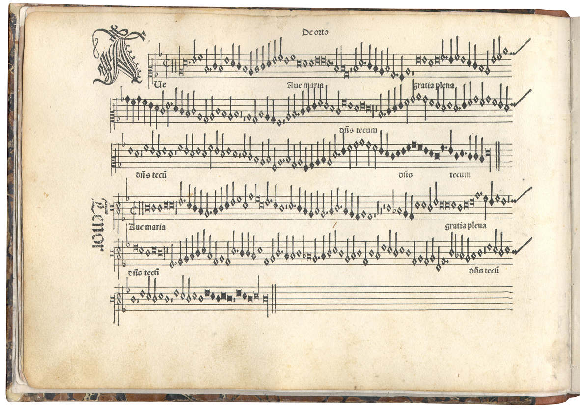
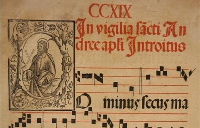
1501
1501, OTTAVIANO PETRUCCI and Early musical printings
Cultural Background
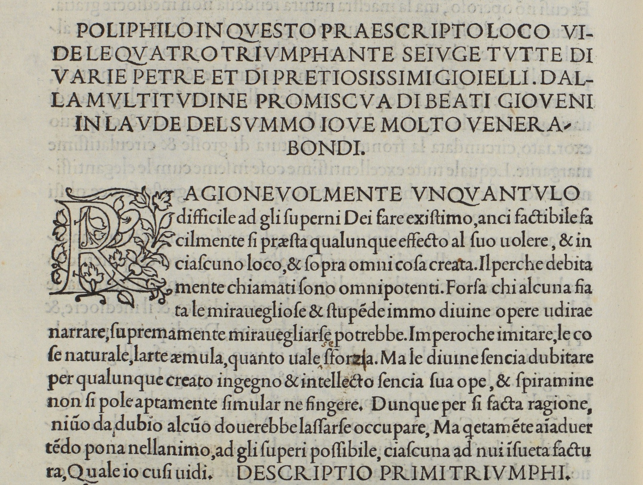
For the ante quem 1800 style of our Circus Magazine, we decided to get inspired by the clean, elegant and essential graphics of some early examples of printed music in 16th-17th centuries. Mainly, we took as reference the work of Ottaviano Petrucci (1466-1539), but also considered coeval printed books – e.g. by Aldo Manuzio – and traditional practices in the writing and printing of music around that time.
Typography
The retrieval of a suitable font which could be at the same time readable as well as resembling the typography of 16th century was not easy. The choice fell on the IM Fell Great Primer font by Igino Marini which was used in both its normal as well as all its all capitals version (IM Fell Great Primer SC), as to simulate their combination and or alternation in early printed books for headings, authors, prose and poetry. In addition, as to resemble the practice of coloured, decorated initials, we adopted the floreal Arabesque Initialen Font, still from 1001 Fonts.
Colours and Images
As for it is for early printed books of music by Ottaviano Petrucci, such as the Harmonice Musices Odhecaton (ca. 1501), we limited our choice to a dark brown colour for ink-ish texts over the background image – set to the <body> element as to resemble a unique sheet of paper. The only other colour present is the dark red with lighter red on mouse-over, inspired by ancient book’s rubricae, by decorated initials and by ancient sacred music – where musical notes where black over the four red lines staves.
Layout and Details
We decided to express as much as possible the essentiality and wide use of negative/white space, thus developing a quite simple and clean layout. For the Bibliographic References’ section, we customized the dotted list style by means of the rendered screenshot of a note in squared notation from the Odhecaton’s digitalization available at IMSLP.
1898
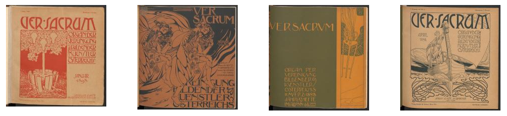
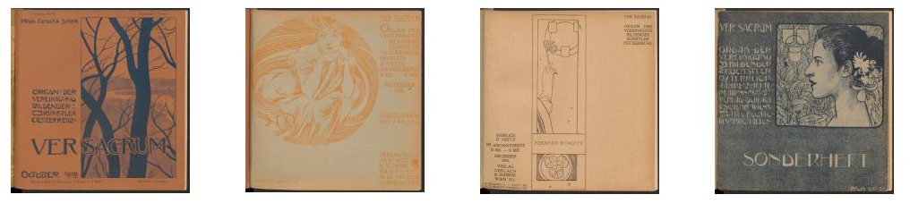
1898, VER SACRUM
Cultural Background
The XIX century cultural period style have been inspired by the late-century reference from Ver Sacrum Vienna Secession’s official magazine founded by Gustav Klimt and Max Kurzweil and published from 1898 to 1903. In particular, 1898 is inspired by the first 2 year issues (1898-1899) of the magazine.
Typography
Lacking a specific Viennese’s secession title font, the Rivanna art-nuveau-inspired has been selected for titles and drop caps and downloaded from Dafont.com.
For the rest of the body, we sought for a serif font which matches the Jenson font family with the typical lowercase e characterized by a slanted horizontal bar. The Jenson font, was originated by engraver and printer Nicolas Jenson in Venice around 1470 and one of its modern revivals was the Golden Type made by William Morris for the publication of his Kelmscott Press. According to Daniel Verfasser Lawler (Adolf Loos, William Morris, and the Golden Type. Umění 2020: 42
), the Golden Type had a global success in the United States and in Europe. The font was widely used in Austria as well, and it was used both in Ver Sacrum
, in the Journal of the Wiener Werkstätte, as well as even in Adolf Loos'
Das Andere
. Several digital edition of Jenson's font are available: the used one is a version downloadable from Freakfonts.
Ver Sacruminternal page (1898, 12, p.10)
Ver Sacruminternal page (1898, 2, p.32)
Colours and Images
The main reference for this part have been the covers’ colors of Ver Sacrum, with a strong use of a bi-cromatic combinations of lighter and darker earth colors such as black, burnt sienna or pearl with brick-red, grey, green or sienna yellow.
Article bodies use black writing on light background, photo images have been filtered with a sepia nuance and some percentage of opacity.
Layout and Details
The Jugendstil visual richness has been reproduced by using decorative drop kaps and paragraph end, and decorations for the final publication notes.
We also used Ver Sacrum
internal ornaments for a Jugendstil web-adaptation through a customized scrollbar (Chrome optimezed)
Ver Sacruminternal page (1898, 2, p.33)
Ver Sacruminternal page inspiring custmized scrollbar (1898, 10, p.8)
1926
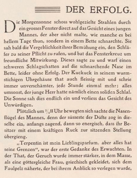
1926, MODERNISM
Cultural Background
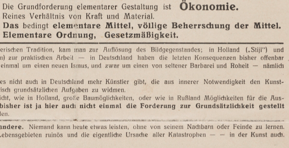
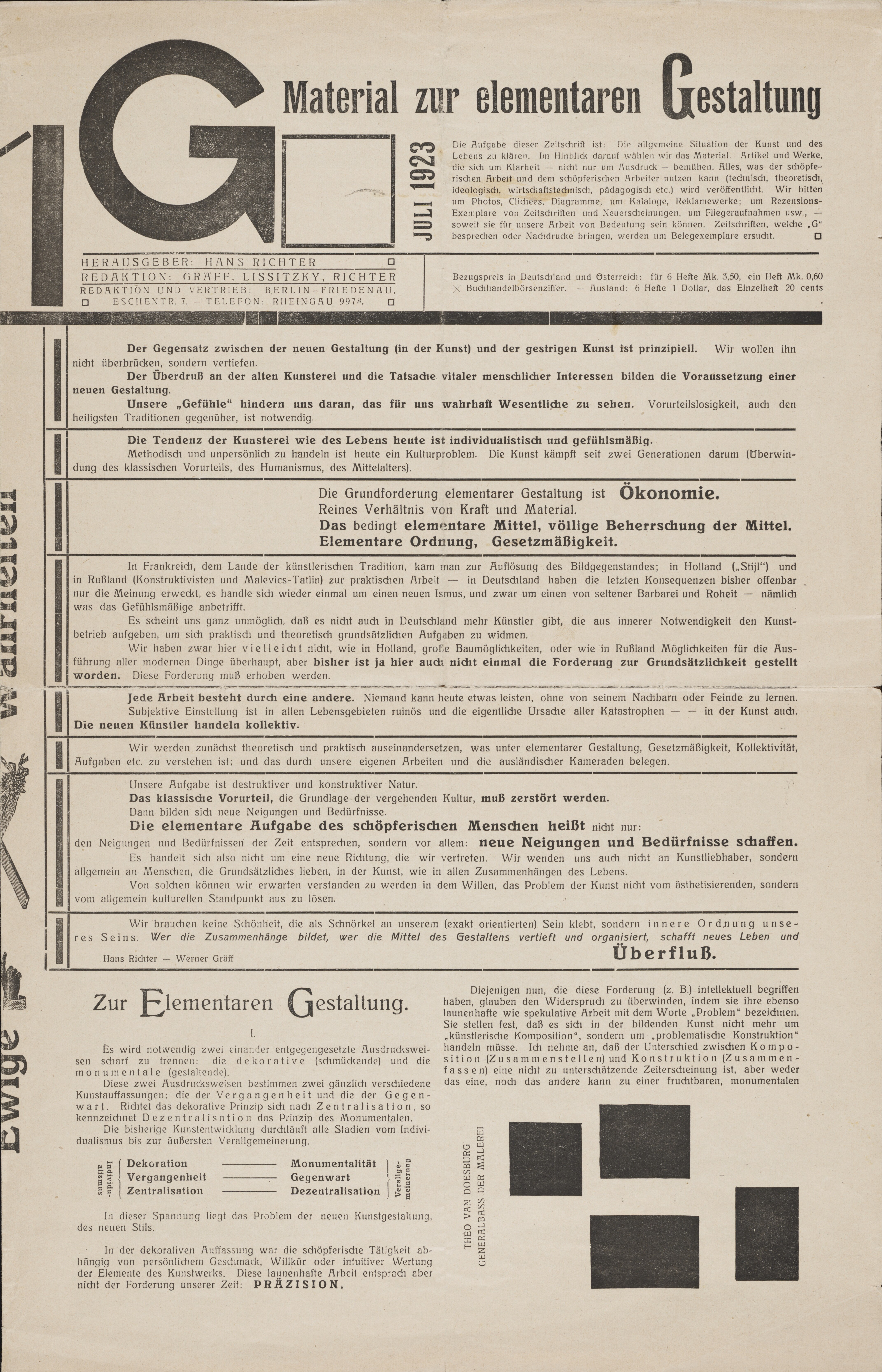
For this period we chose the Modernist movement as a reference. The movement had a deep influence not just on architectrure and design, but also on typography leading to an innovative use of compositions of text and images and fonts.
Our main published references have been the art journals G Material zur elementaren Gestaltung
, Sovremennaya arkhitektura
, Bauhaus
and Veshch Gegenstand Objet
(digital copies from Monoskop
).
Typography
For the header and the general frame fonts, we chose the Staatliches Google Font that, as declared from its source, was designed in response to Herbert Bayer’s title lettering on the cover of the first Bauhaus exhibition catalogue, which was published in 1923
.
For the article texts, we used Berthold Akzidenz-grotesk downloaded from FreeFontsVault.com. This font which was produced for the first time in 1898 by Berthold type foundry, appears in some of the text from the first issue of the Bauhaus
magazine. Akzidenz-grotesk was one of the first sans-serif fonts and it served as a basis for the development of Helvetica.
The line-height has been adjusted in order to better meet the dense typography of our examples.
Bauhausmagazine.
Colours and Images
Black, red and white have been distinctive colors of the 1920s. Apart from our references as the covers of Sovremennaya Architektura
and G Material zur elementaren Gestaltung
, we can remind earlier prestigious references as El Lissitzky's graphic and posters and the russian costructivism.
Photo images, even when in colors, have been modified with a greyscale in order to reproduce the black and white photography of the time.
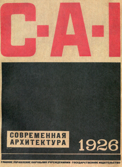
Sovremennaya Architektura.
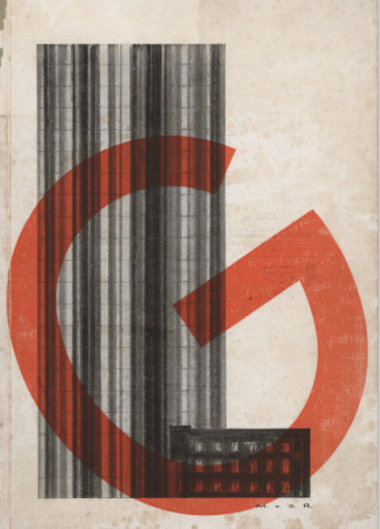
G(Jun 1924 number).

Konstruktivizmby Aleksei Gan, 1922
Layout and Details
We have strongly played with the grid boxes and we adopted a 3-vertical columns viewer in order to reproduce the complex organization of the selected examples.
Black thick rows and lines isolating titles and references, as well as the black background for the scrollbars, has come from Sovremennaya Architektura
.
Rounded black points to mark paragraph in the central-colum article have been inspired by Moholy-Nagy article layout in the Bauhaus journal.
We took inspiration from our sources also to style the entities higlighting: when recalled by the Metadata-selector, they are indeed marked with a bigger and more weighted font-size.
Sovremennaya Architektura.
Bauhausjournal (1-1-1926 p.5).
G Material zur elementaren Gestaltung(1 Jul. 1923).
1959
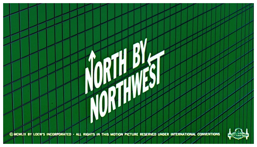
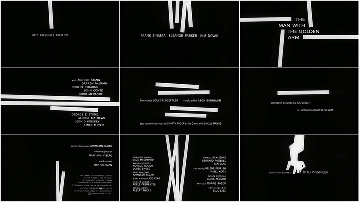
1959, SAUL BASS
Cultural Background
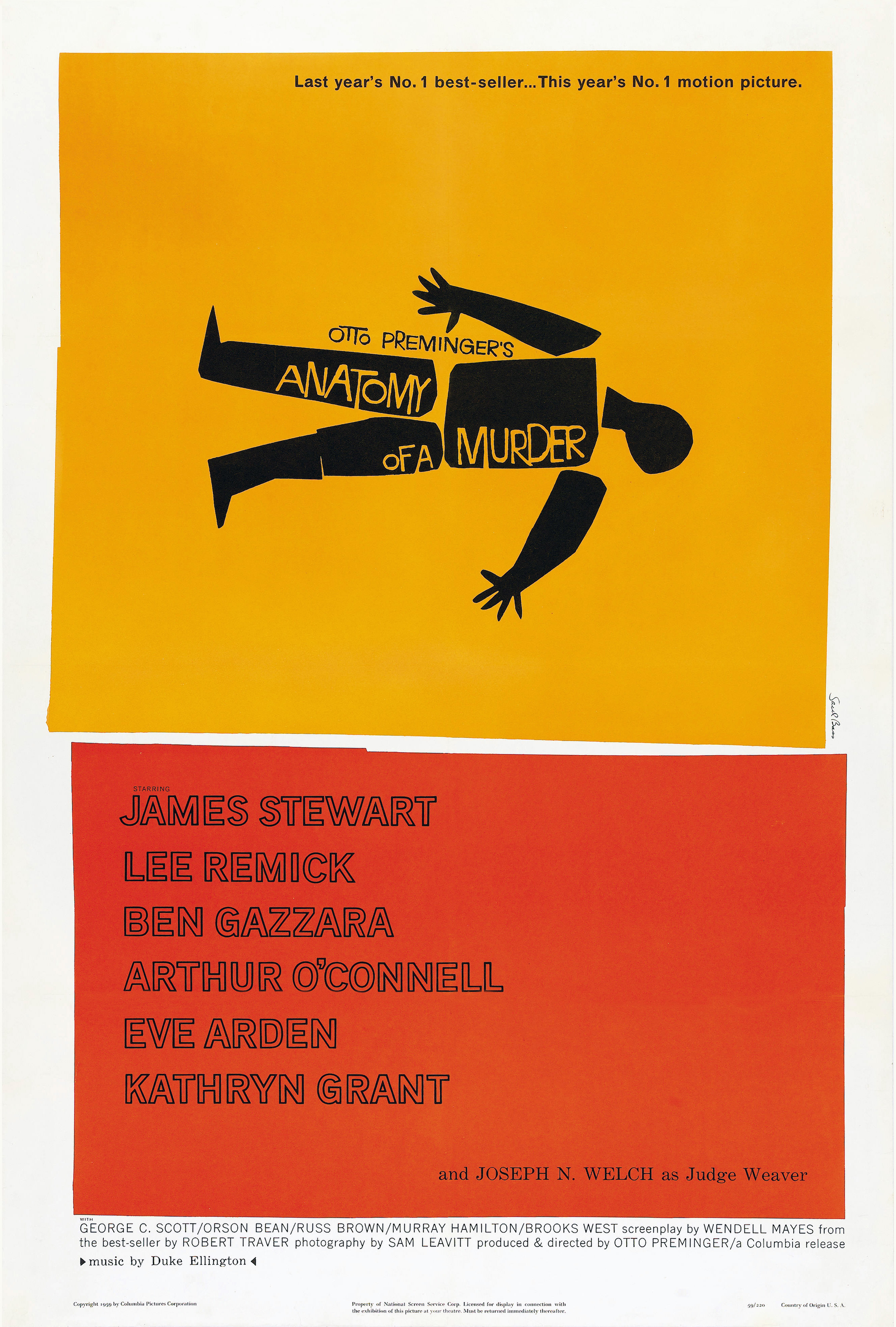
As representative for the cultural period 1950-1989, we decided to adopt as theme the work and aesthetic of Saul Bass (1920-1996), the graphic designer known for his title sequences and movie posters design. A strong characterization in font, a peculiar use of colours, essential, clean, creative and neat delineation of graphical areas could be of great inspiration and example for web as well as for graphical designers.
Typography
At first, browsing on the web for fonts resembling the Saul Bass typography, we found the Hitchcock font by Matt Terich: this seemed to be the perfect solution for our purposes, but unfortunately it had to be discarded due to its copyright policy. We then thought about the 1001 fonts’ Double Bass font, but this had indeed issues with the encoding of numbers, which weren’t readable indeed. Thus, the choice fell on Bassanova by Julia Bausenhardt, which seemed to be quite accurate as well as the previous ones, if not more. We combined, throughout the Issue Viewer, different font sizes, decorations – e.g. using font-variant-ligatures: discretionary-ligatures – and an assorted use of colours as to express variety and to break the flow of words with highlighted and engaging keywords, bibliographical references and emphasised words, in line with the bold aesthetic of Saul Bass.
_-_movie_poster.jpg)
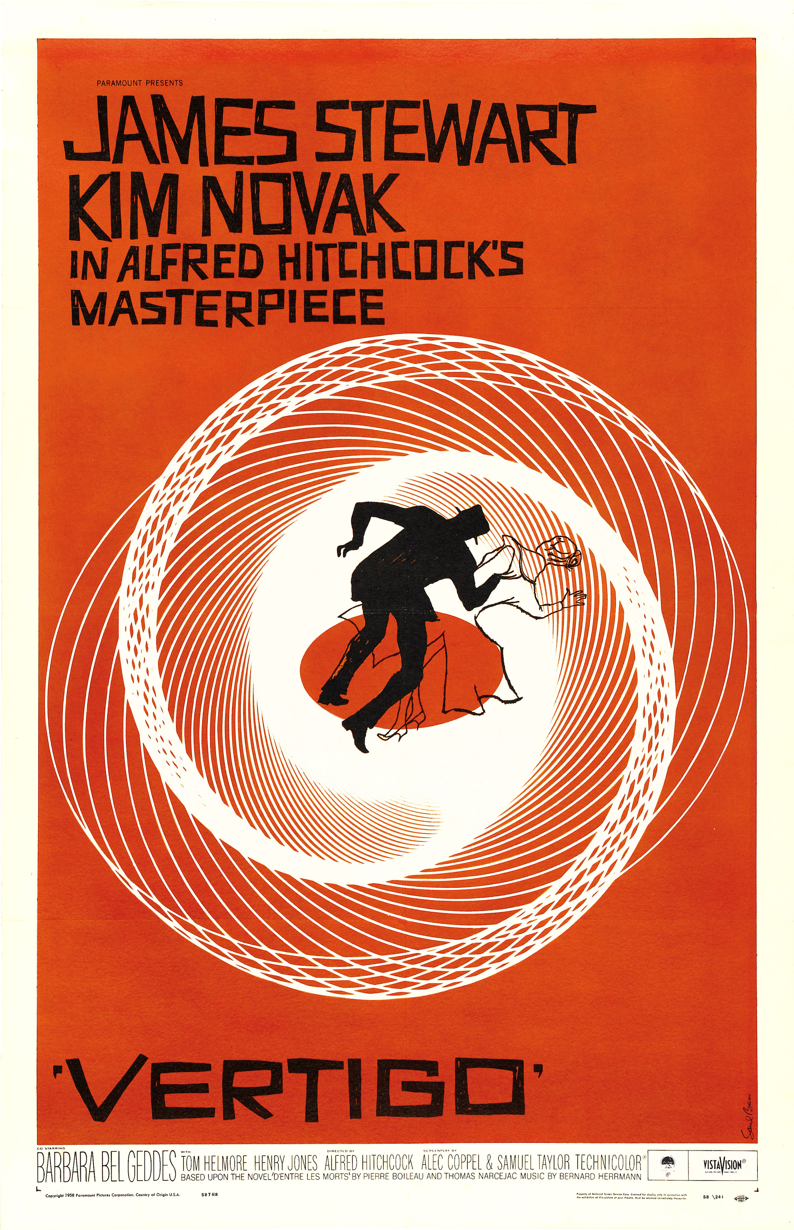
Colours and Images
For what concerns colour, the philosophy of Saul Bass seems to be quite straightforward: not many colours (generally 3 or 4 maximum), but vivid and striking. For our Circus Magazine theme, we decided to resemble as much as possible this ethos, but, of course, taking into consideration also the many layers of content available in the Issue Viewer. For these reasons we created a palette of few, precise colours and assigned them based on Saul Bass' iconic title sequences or most celebrated movie posters, as well as on the semantics of our webpage – e.g. minor headings being lighter nuances of the intense colour of the major heading.
The Skew Property and Details
In order to express the dynamic combination of areas of colours that intersect and overlay with plenty of diagonal lines instead of standards square angles, we decided to play with some content containers, such as the <div> elements of the sections of the articles or the headings. By means of the css skew property, we applied a skew rotation to those elements on which this would not have resulted in a diminished readability for the web user. Some examples are the articles’s main headings, the section titles, the bibliographic references section. For this very last portion of the articles, the dotted list style was customized by means of the creation of an image from the star character with Double Bass font.
2000
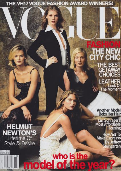
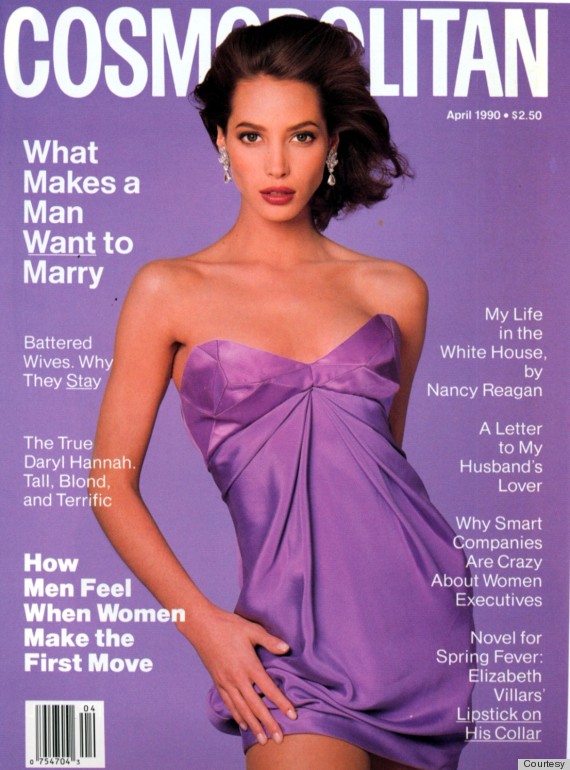
2000 VOGUE
Cultural Background
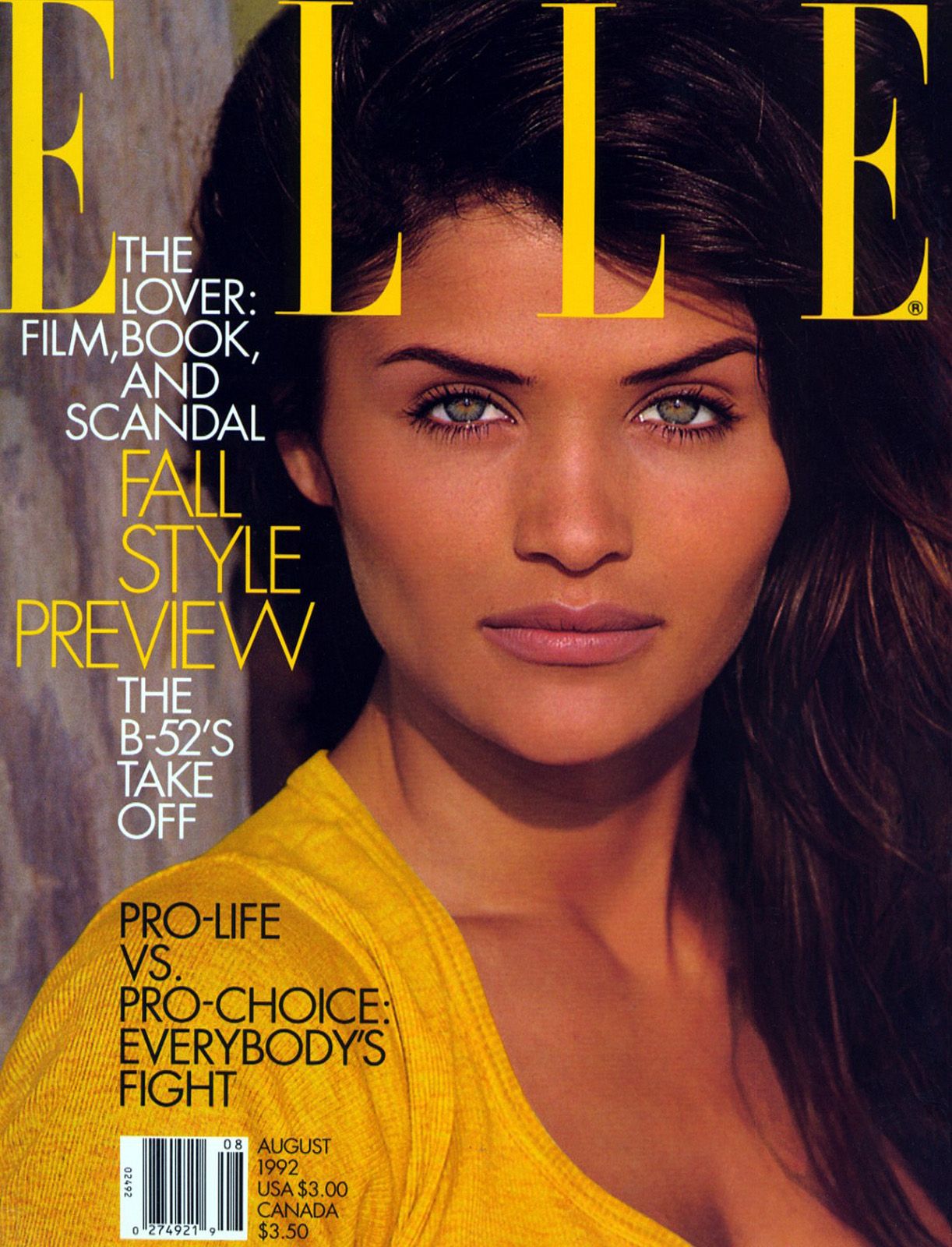
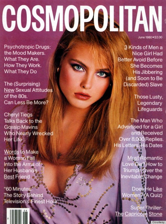
The 90's represented a revolution under every aspect, it is the period of the capitalistic revolution and the economic growth. This age depicts a restart as well as for the graphic design area, which shows some new revolutionary peculiarities. In order to represent the style of this period in a graphical web layout we decided to inspire it to the most emblematic magazines: Elle, Vogue, Cosmopolitan.
Typography
The typography of this period doesn't show any particular rule, on the contrary, the peculiarity of this age is the absence of layout rules. The font is used in all its aspects, bold and coursive, and in many different sizes, all combined in a single page. For the main content of the articles the fonts used in the print culture of this age are all characterized by thickness and height. The font families chose for the style of the site are three: 'Oswald' for the header, 'BenchNine' for the maincontent, 'Arapey' for the articles' titles; all these fonts are provided by Google fonts.
Colours and Images
In this age, the print becomes part of the consumistic economy; the magazine wants to be attractive, with glowing and bright colours, layout games and full page images. The page has no more borders, no standard rules about line-height or margins. The image become part of the text, wich follow its shape; the figure caption is an element with which to play, giving it colour and sometimes overstating the figure. For the layout of the site we decided to adopt some of this features, like the highlighting of the figcaption, the text of different size and decorations, the bright colours with nuances of red and purple.
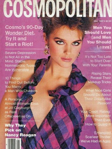
The Grid Layout and Details
It it possible to recognize as one of the main peculiar features of this age the grid layout of the page. Indeed, the text will be no more on the full page, but on a division of two or more grids, sometimes overstated by figures and capital letters. We decided to adopt this layout but also to adapt it to the digital device view: the page is divided on two columns trough the column-count property, since the readability would have been difficult we decided to put in just one columns some elements like tables, trough the css property column-span.
2040
2040, FUTURE THROUGH CINEMA AND LITERATURE
Cultural Background
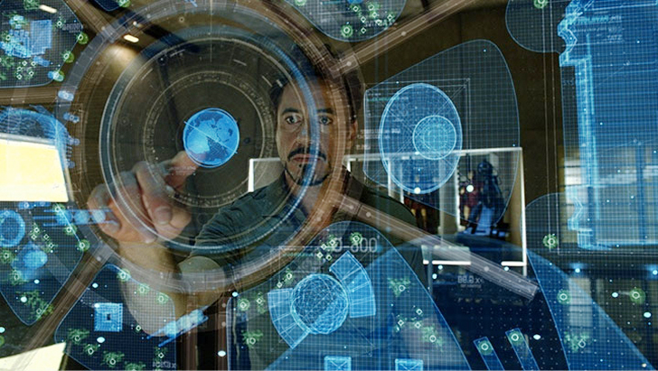
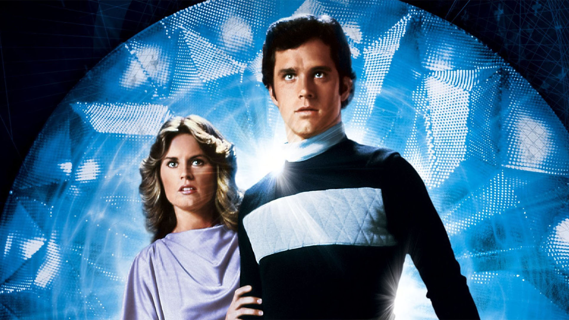
Many representations of the future have been provided, in the history of literature and cinema, giving it some recurring peculiarities. In order to represent a "non-existing" period's cultural background, we decided to take inspiration from the most iconic films (from different historic periods): Logan's Run, Back to the future, Terminator, Star Wars, Matrix, Marvel Cinematic Universe.
Typography
The fonts' choice has been related to the fictional absence of handwriting in the future and the preponderance of the computer and the A.I. writing "aesthetic". These font families only have squared angles, due to the pixel division of a computer page. Some other font families are inspired by some of the most famous science-fiction film posters, all of which show a bold weight and an high width. We chose the 'Orbitron' family, which seemed to be the most suitable to the posters' aesthetics.
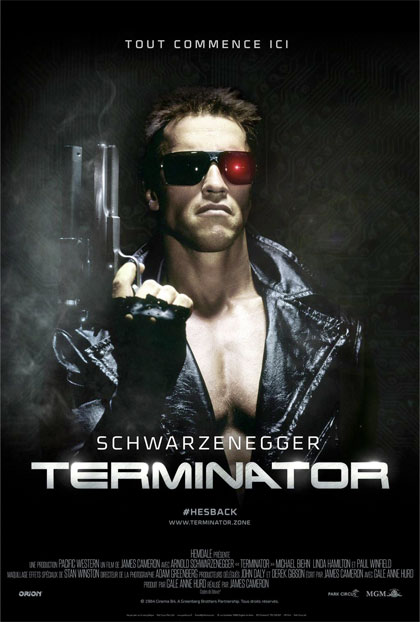
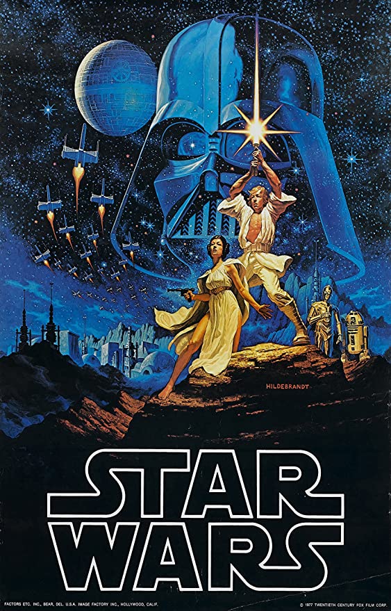

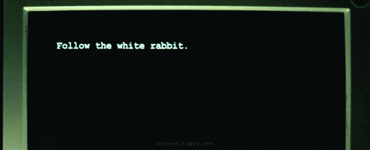
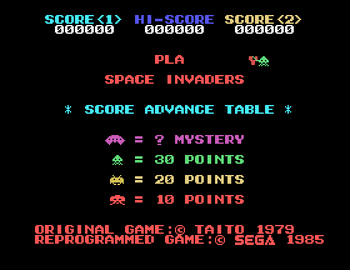
For the main content we chose the 'Wheaton Capitals-Regular' font family, which recalls the computer codes' writing and the old Arcade games' layout (e.g. Space Invaders); in this case the choice of the colours (neon) and font properties (shadow) was essential to make it look more "futuristic".
Colours and Images
The choice of the colours was pretty simple but difficult at the same time: at first, the idea was to use "fluo" colours as green, purple, blue, orange, in order to be inspired by the canonical representation of the future in cult movies; but ultimately, the purpouse was to provide an idea of how a similar platform could evolve in the future, with new more sophisticated devices and technologies. Therefore we tried to represent the absence of colours, since hologram interactive techonologies, which are more and more studied, present no colour; in particular, we tried to represent this last concept through the use of a dynamic background showing a "high-tech aesthetics" network.

Opacity and Shadow Property
In order to represent the concept of transparency given by the absence of background in the fictional futuristic hologram technology, we decided to exploit the css opacity property for the text's background and the shadow property for the text. This makes it more readable and gives it a sort of "laser" effect, recalling the old science fiction cult movies as well.
ABOUT
The Project Team
Alisia Zarbo
Books-addicted since childhood; she loves nature, loneliness and doing things with her time.
Enrica Zani
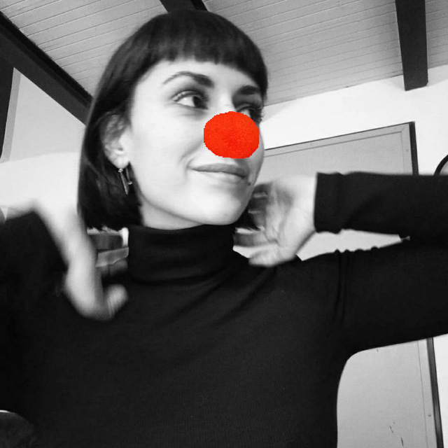
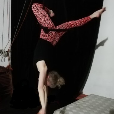
Fascinated by languages, art and design, encoding, automation, acrobatic tricks, and botany.
Ilaria Rossi
Early music, philosophy of language and Logic lover.
Transdisciplinary and creative by nature.